Visualise Data Using Charts and Dashboards
Page Topics:
After setting up your data model and insight tables, you are ready to turn the data tables into visualisations. If you are not sure how to set up the insight tables, you can follow this link.
Setting up a visualisation requires the following steps:
- Create a chart
- Save the chart in a new or existing dashboard
Create a Chart
The first step is to explore your data using the charting tool. This is a visual method of engaging with your data and building your graph at the same time.
- To get started, navigate to the Datasets, Data dropdown menu, and click on the Table name that you want to build a chart on.

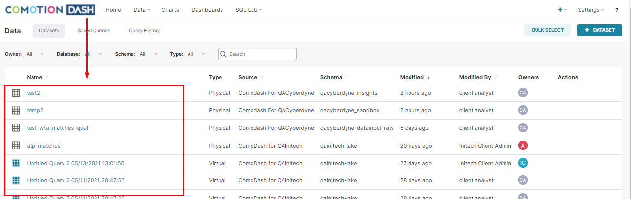
- This will display the Chart creation page.
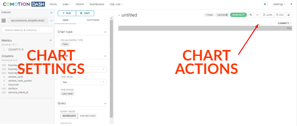
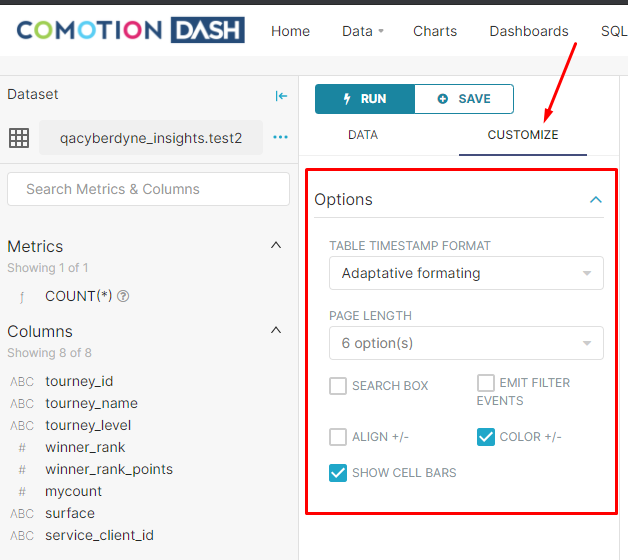
Chart Settings
The below settings will help you to configure your selected chart.
Not all chart settings are the same
The chart settings differ according to the type of chart selected and depending on the requirements of the chart.
There are a couple of settings and buttons that you will find on all the charts:
Run
The Run button reruns the chart.
Save
The Save button allows you to save the chart and add it to a dashboard. More on this below.
Datasource
Here you can change the data source that the chart is based on. Usually, once a chart is created, you shouldn't move it to another data source - but rather start fresh. However, there are a few scenarios where this is useful.
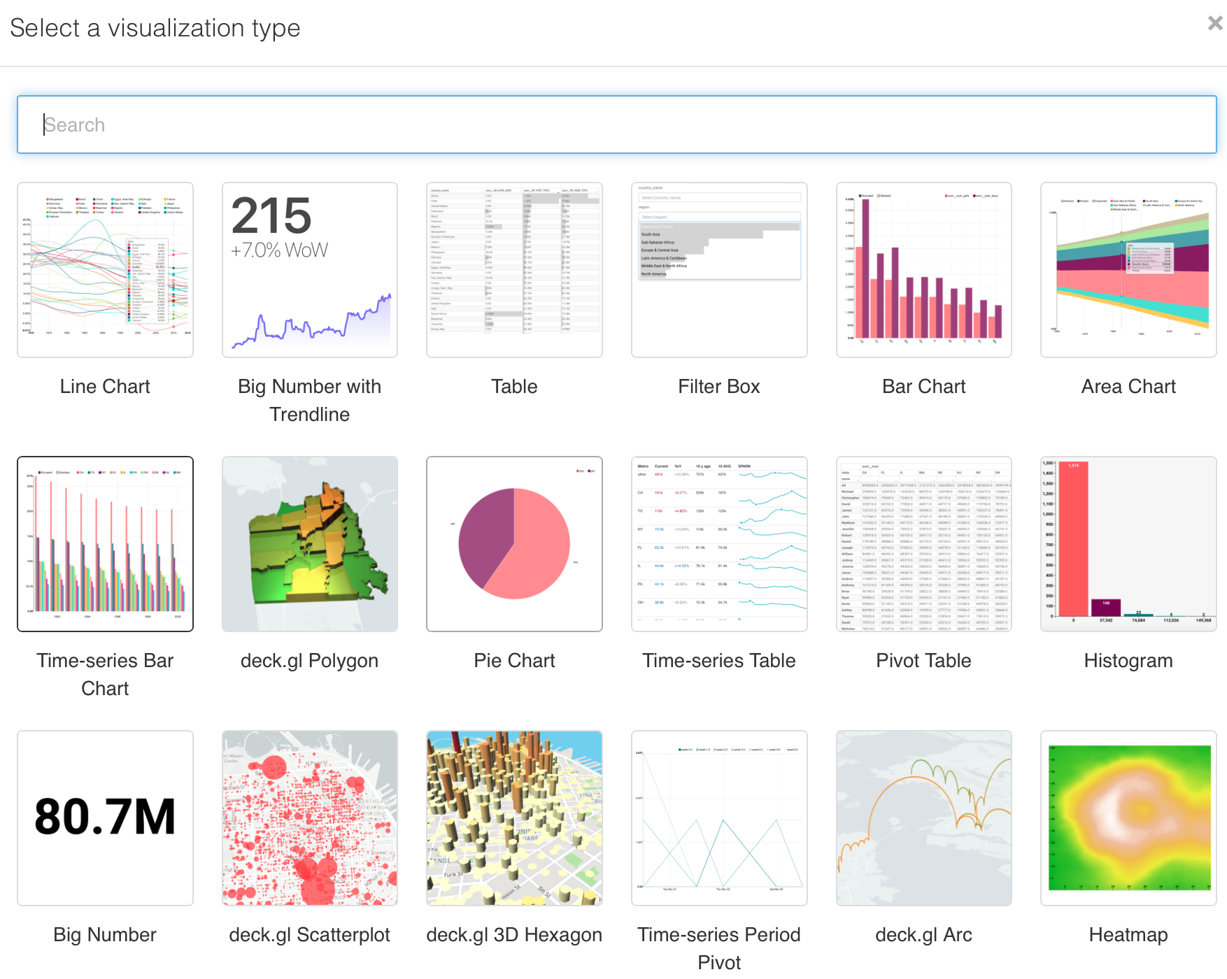
Visualisation Type
Select the visualisation type. This is where you will see the various chart types available, and includes bar charts, pie charts, etc. The picture below shows a snippet of what is available.
Time Column
The time column is used as the primary time dimension.
Time Grain
Time grain controls what periods are shown on the graph. For instance, if a year is selected, then graph data will be grouped by years.
Time Range
Limits the start and end times of the graph. This makes it easy to show insights such as "last week's sales".
Getting to know the different graphs
The best way to learn how to use the various charts is to play around and familiarise yourself with them.
Each chart has unique features, but generally include the following types of options:
Categorisation- A categorisation option, often called Group by which defines
which column to use as your categorisation. (For instance, if you are interested in the number of red and blue boxes that are in a data set, then the column you would use would becolour).Metrics- The actual value that is to be used for the graph. You can add values that you often use to the table under theDatasource options(look for the metric column)
Chart View
The chart view section shows the resulting chart and how it will appear in the dashboard.
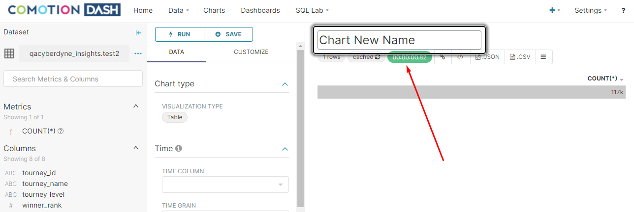
To rename the chart:
- Click on the Name tab at the top of the user area.
- A text box will appear in which you can rename the chart.
- The number of lines is shown at the top of the chart view and represents the number of lines that have been returned from the Dash backend to draw the graph.
Keep in mind
This number should not be too large as these lines are all downloaded to the browser, and too many lines could result in the browser slowing down or crashing.
Understanding Caching
All results are stored for up to 2 hours which means that during incessant runs of a chart, the previous results are shown. This helps with reducing the load times of dashboards and charts.
To refresh the source data:
- Click on the Cached button.
- If the results are cached, the Cached button will disappear from the chart view.

Deprecate Persisting URL Paramaters
If you save a chart after adding URL parameters and a filter, it will still recognize and accept new URL parameters without replacing the ones you initially set. This is great for integrating charts into other apps, allowing them to automatically adjust based on the parent application's preferences.

Older charts
If you have older charts that used these link settings, they'll work as before. But if you make changes and save them, those link settings will disappear. So, you might need to do a bit of tweaking if you update those older charts.
Saving Charts
Charts need to be saved before adding them to the dashboards.
-
Click on the Save button on the chart setting page to open the modal box and save the chart.
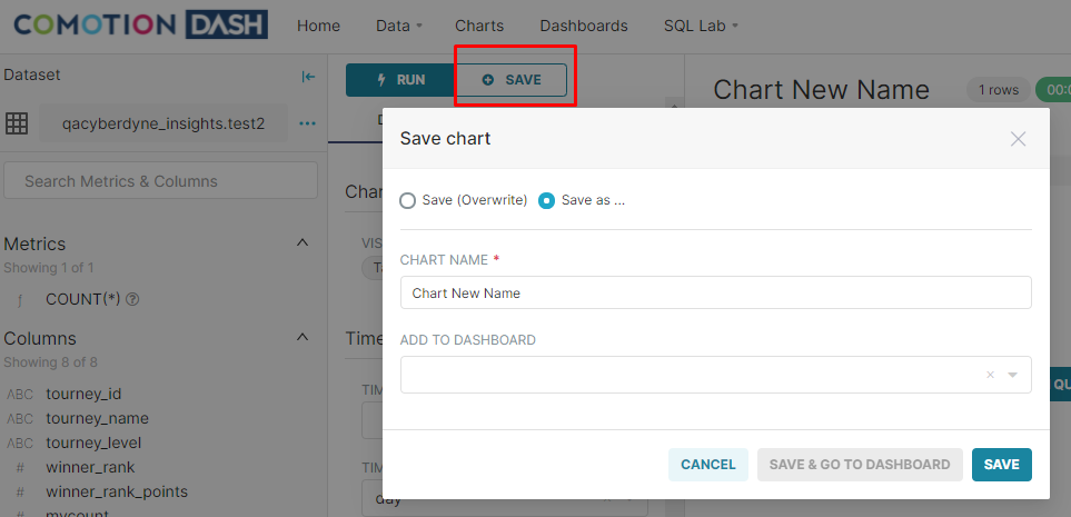
-
This will save the chart and show the option to automatically add it to a new or existing dashboard as well.
Exporting Charts
Exporting a chart is simple. Either export the chart using the exiting JSON file or CSV options or choose the Download as Image option on the hamburger menu.

Time Series Chart
The time series chart gives you more control and the option to show multiple views such as stacked area charts.
View Charts in Dashboards
You can create a dashboard from the chart save modal as explained above or create a new dashboard.
To create a new dashboard:
-
Click on the plus (+) button in the top right corner of the navigation menu. Select Dashboard

-
The new dashboard can now be viewed.

Filter Mapping
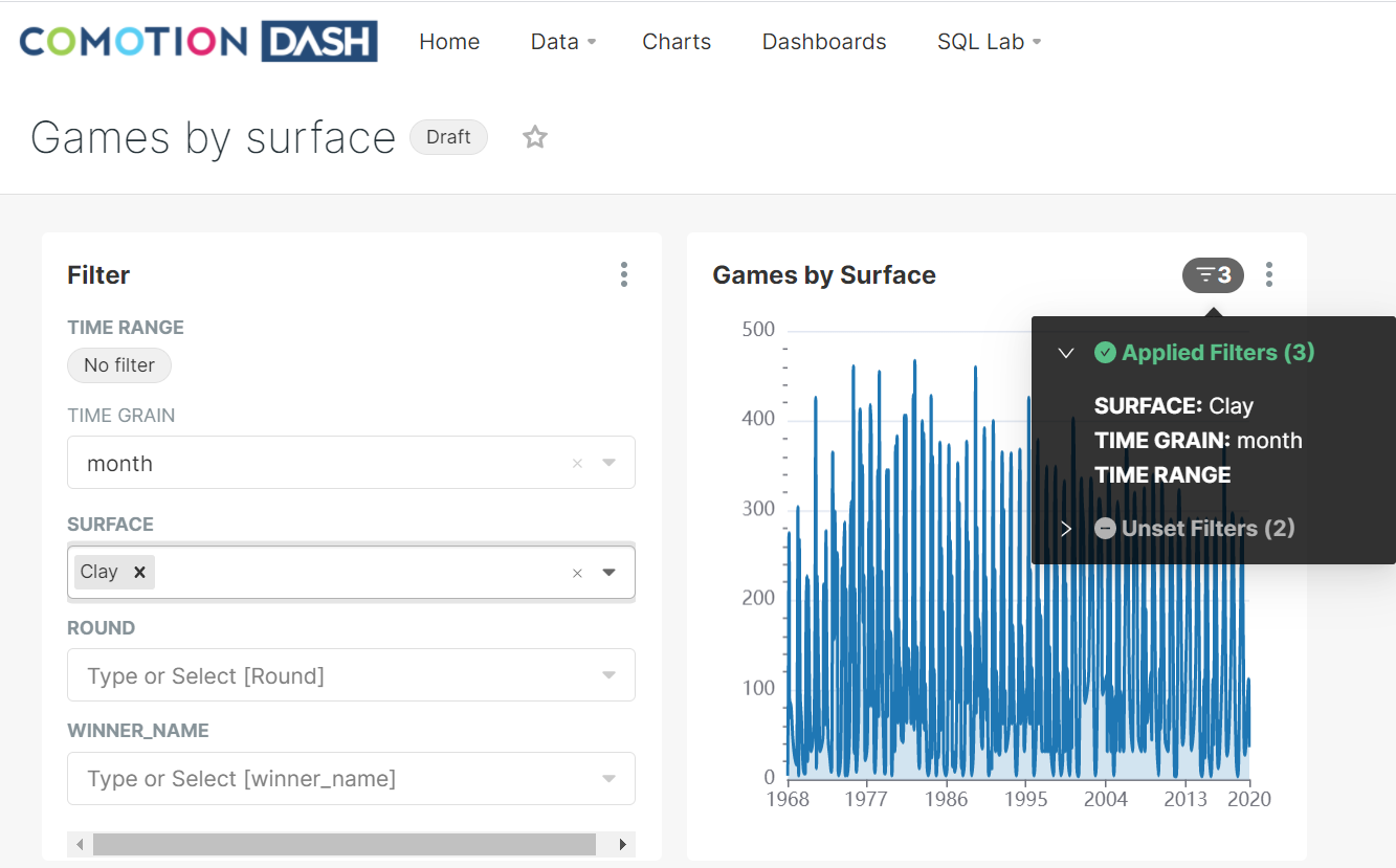
The filter mapping functionality allows you to choose one or more filters that can be applied to each chart on the dashboard view.

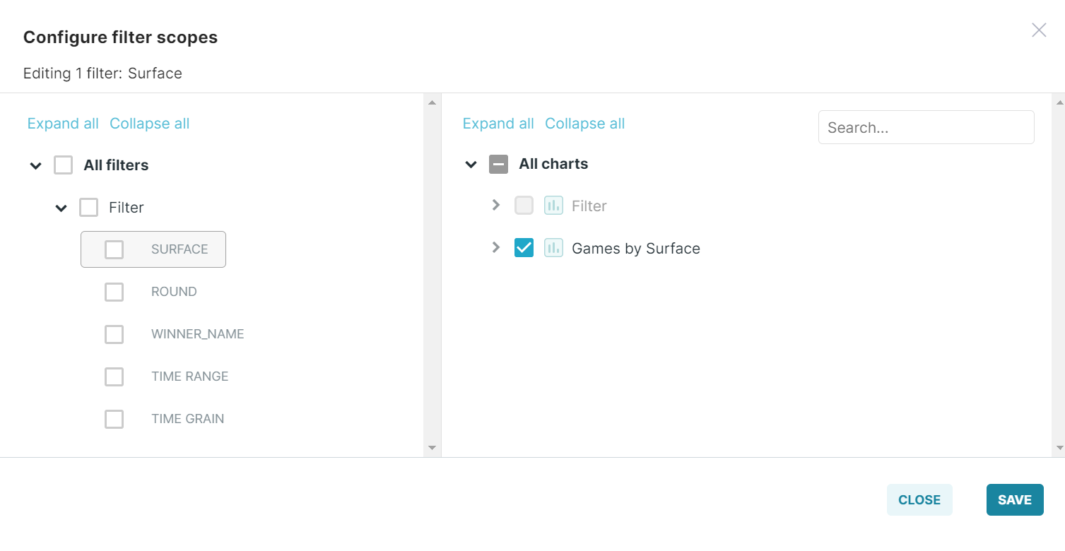
- On the selected chart on the dashboard, you will see a filter icon with a number next to it. If you hover over this icon, it will indicate the number of filters applied to the chart and the number of filters that remain unset.
- Next to the filter icon, you will see the kebab menu on the selected chart. It gives you the option to maximize and minimize the chart.
Edit Dashboard Properties
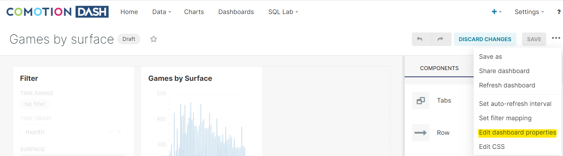
For a better user experience when working with the dashboard, we have enabled editing of basic dashboard information, such as:
- Title: The title of the dashboard
- URL Slug: The readable URL for your dashboard
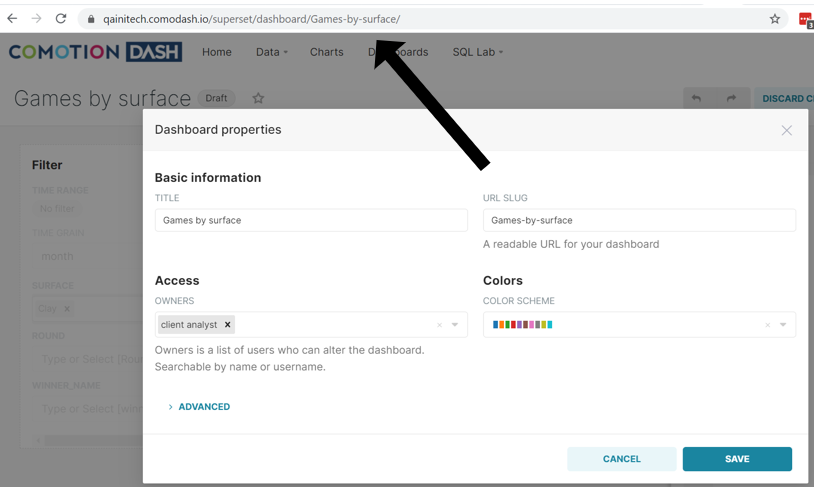
- Access: The list of owners who can alter the dashboard.
- Colors: 13 different color schemes to apply to the dashboard.
Exporting Dashboards
Once the dashboard has been saved, you have the option to export it via the existing CSV option or the Download an Image option.

Before you go
This documentation portal has been created to be your right hand of guidance on this journey. We will be evolving the content from time to time and if there is any specific information you want us to add to improve your experience, please get in touch or send us a direct email to dash@comotion.co.za.
We love hearing from you!