Announcing New Comotion Dash Version
17 January 2023
Improved Filtering for Dashboards, Insert Tabs in Columns, New Chart Customization Features, and Much More!
Page Topics
Introduction
We are thrilled to announce that a new version of Apache Superset, the Comotion Dash visualization layer, will be released on January 28th, 2023. The new version includes several new features and improvements that will enhance overall performance and user experience.
Improved Filtering for Dashboards
With the Apache Superset upgrade, you will have access to new configurable filtering features and the ability to expand or hide all filters from your dashboard view.
Some benefits of this filtering functionality include
- Much easier to add and edit filters as opposed to using filter boxes.
- Much easier to edit the filter mappings (scoping section).
- Easy access to filters when in any section of the dashboard.
- Reduce the number of filter boxes in the dashboard to decrease cluttering and free up space for visualizations.
- More advanced configuration options for filters compared to filter boxes.
Upcoming Deprecation Notice for Filter Boxes
If a user accesses a dashboard featuring an editable filter box, a pop-up message will appear stating:
'filter_box will be deprecated in a future version of Superset. Please replace filter_box with the dashboard filter component.'
However, there is currently resistance from the community against the deprecation of filter boxes, so no changes are required at this time.
How to Configure your Filters
When you are ready to configure your filters for your dashboard(s), consider the following best practices:
- Apply a scenario mindset: Think through different scenarios to choose which Filter type would best suit your dashboards.
- Be clear and concise when naming your filter:
- What is the outcome after the filtering is applied?
- Which charts/sections should it affect?
- Does the title reflect what should be displayed?
Access your Filter Configuration
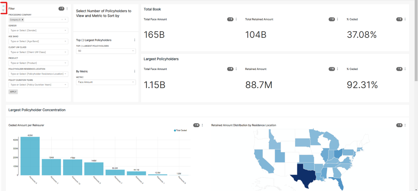
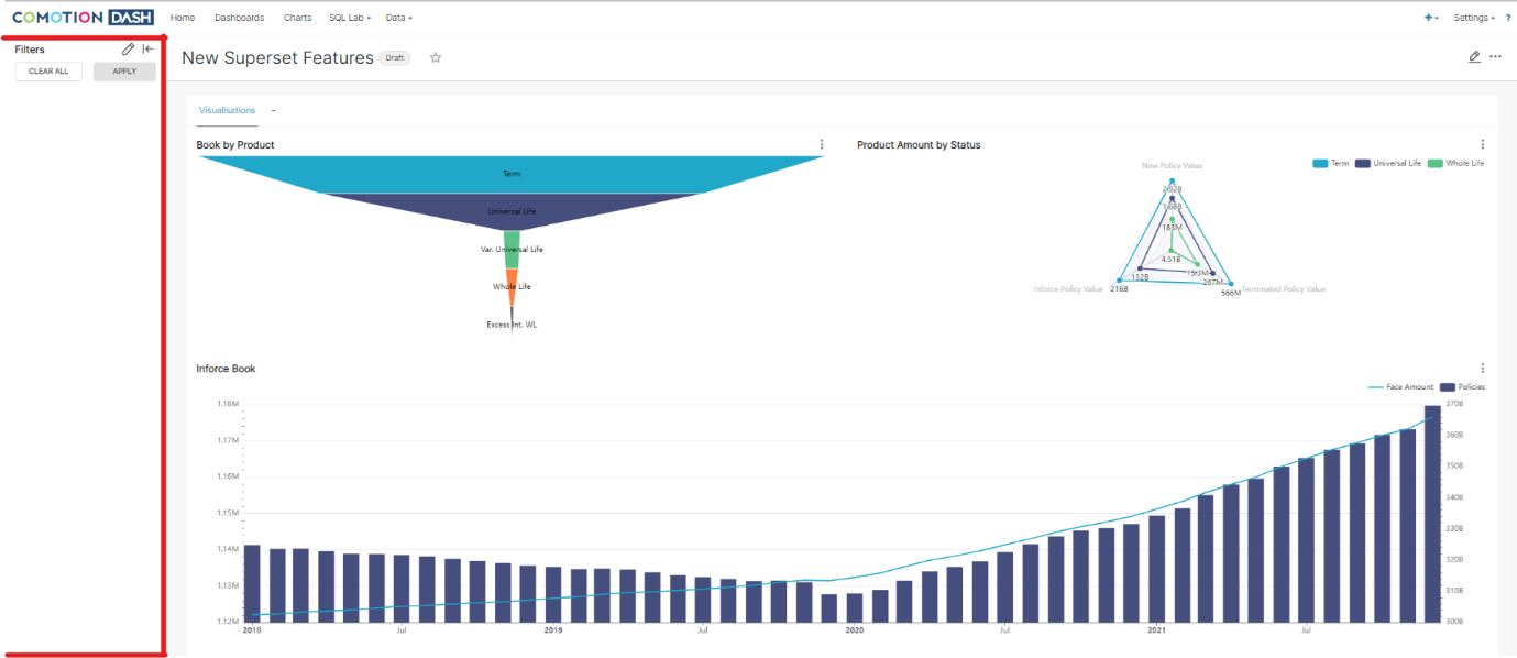
Click on the arrow icon in the top left-hand corner to expand the filter navigation pane to configure your filters and expand or hide the navigation bar.
To configure the filters, select the pen icon to add or amend the filters on your dashboard.

Once you are happy with your configuration, click Apply and hide your navigation bar to see the results take effect on your dashboards.
Configuration Tab
To help you identify your filters in the navigation pane, there are four fields you can complete when creating your filter. This will help you in the future when you want to amend a filter that was previously created. These fields are:
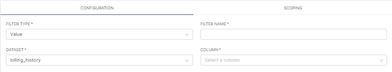
Herewith is a breakdown of each field and its functionality:
| Field | Functionality | Example |
|---|---|---|
| Filter type | - The Value filter allows you to select distinct values to filter by. |  |
| - A Numerical range filter creates a slider to select data based on a range of numerical values. | 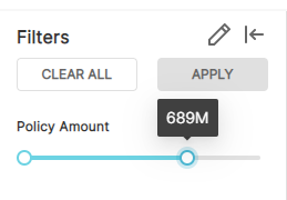 | |
| - The Time range, Time column, and Time grain filters allow you to edit the period on which visualizations are based. | ||
| Filter name | A label/title for this filter. | |
| Dataset | A structured collection of data used to generate the required dashboard(s). | |
| Column | The column in the chosen dataset you want to filter on. |
Basic Configuration
In the Basic Configuration section, multiple tick boxes can be selected for your filters to make your experience more efficient and consistent:
| Function | Functionality | Example |
|---|---|---|
| Default value | Select this option to specify the default filter values on the dashboard load. |  |
| Multiple select | Allow (select) or disallow (deselect) multiple selections in the filter (only available if filter type is a value). | |
| Required | Select this to force the filter to be populated. |
Advanced Configuration
To apply advanced filtering, complete the desired tickboxes to take effect on your dashboards:
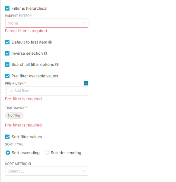
Herewith is a breakdown of each field and its functionality:
| Field | Functionality |
|---|---|
| Filter is hierarchical | Select another filter to be applied first (parent filter) to the dashboard before this new filter (child filter) is applied to the resulting data. |
| Default to first item | The default value of the filter on the dashboard load will be the first value that appears in the filter dropdown. |
| Inverse selection | The filtering will be applied to those values not selected in the filter. |
| Search all filter options | If this is not selected, the numerical values selected will be limited to 1000. |
| Pre-filter available values | Pre-filter the filter so that it only shows the desired selections. |
| Time range | The time range applied to the filter. |
| Sort filter values | Sort filter values in the dropdown by a related metric and in ascending or descending order. |
Scoping Tab
Scoping allows you to select which filters affect which sections and visualizations of your dashboard.

Insert Tabs in Columns
Tabs no longer need to take the entire width of the dashboard. By inserting a column object into the dashboard, you can reduce the width of a tab by inserting the tab in this column and then adjusting the size.
Some benefits of this functionality include
- Reduce scrolling in the dashboard by nesting tabs instead of placing several charts below each other.
- A large variety of dashboard design options are available.
How to Insert Tabs in Columns
Click on the pen icon in the top right corner of the dashboard to edit the dashboard.
A new screen will be displayed with different components (objects) the user can select to insert on the dashboard.
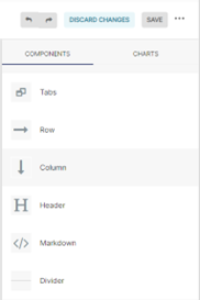
- Step 1: Drag a column object (components tab) onto the dashboard.
- Step 2: Drag a tab object (components tab) into the column on the dashboard.
- Step 3: Resize the tab as desired.
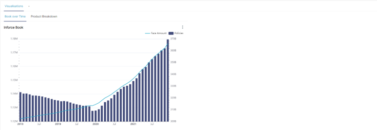
Tab within a tab
In the following example, there is a tab within a tab. This internal tab can be resized because it is inside a column object.
Example 1:
Example 2:

New Chart Customization Features
Several new chart types have been added to the new version of Apache Superset including some useful customization features that have been added to existing charts.
Some benefits of these new and improved visualizations include:
- A greater variety of ways to visualize data allows for better chart selection based on user needs.
- Improved customization allows for more bespoke visualizations.
You can access the different charts by hovering on the Plus Sign in the top right-hand corner of the page and selecting the Chart option.

Herewith are 3 of our favorites:
| Chart Type | What makes these charts great | Example |
|---|---|---|
| Mixed Time Series | - Compare metrics in the same visualization by varying the use of lines and bars in a variety of ways. - The use of multiple y-axes. - No need for use of annotations to combine bar charts and line charts. |  |
| Funnel Chart | - Display the distribution of data by ordering from largest to smallest portion. - Can easily see smaller portions than in circular distribution charts. |  |
| Radar Chart | - Visualize & interpret distribution of data according to multiple metrics. |  |
Additional Features & Fixes
Some additional features & fixes included within the Apache Superset upgrade are
- Supporting Jinja templating in saved metrics.
- Fixed saved query export.
- Implement a time picker on the filter box.
- Add error pages.
- And much more!
Before you go
This documentation portal has been created to be your right hand of guidance on this journey. We will be evolving the content from time to time and if there is any specific information you want us to add to improve your experience, please get in touch or send us a direct email to dash@comotion.co.za.
Check out more information on our previous upgrade.
We love hearing from you!
Image by Freepik